Sunday 26 January 2014

37b. Final Products

These are my final produtcts.
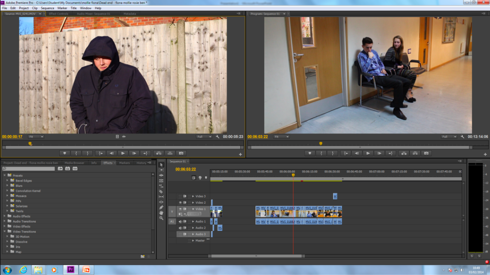
Short Film:


Poster:


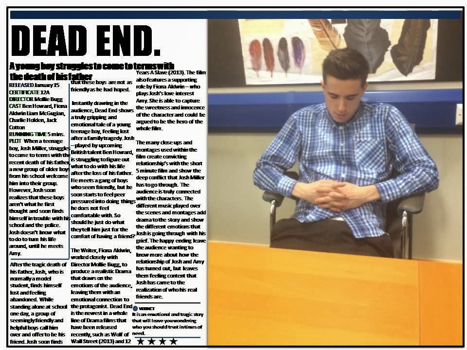
Magazine Review double page spread:

37a. Roles and Reponsibilies within filming

My Roles:
  • Organised Locations
  •  Chief Editor
  • Sound 
  • Played a major role within the Camera Work
  • Made my own Magazine and Poster
Fiona Aldwins Roles:
  • Organised Actors
  • Co-Editer
  •  Played a major roles within the Camera Work
  • Costumes 
  • Made her own magazine and poster
Ben Howard's Roles:
  • Acting
  • Contributed to Camera Work
  • Runner
  • Made his own poster and magazine
Rosie-Mae Christopher's Roles:
  • Contributed to camera work 
  • Contributed to editing
  • Made her own poster and magazine

Saturday 25 January 2014

36. Alterations to film review according to feedback


This is the first draft of my film review article:
 
This is the final draft of my film review article
 
Using my feedback, I have adapted my magazine review article to appeal more to my target audience. To do this, I have added a stand out quote in large blue letters. This breaks up the text and adds more colour into the article.
 
I also added a 'Look Closer' section over the corner of the photograph. This contains 3 facts about the film that the audience may not know. This is a convention of an Empire magazine article which I have based my magazine review on.
 
The last thing I have changed, is adding in a caption to the photo in the corner, this is always used in empire magazine articles and makes the review look more realistic and as if it would be featured in a magazine.

Friday 24 January 2014

35. Film Magazine Article and Feedback

This is the first draft of my film magazine:


I handed out a questionnaire to 20 members of my target audiences and made this slideshare of their feedback

34. Write up of Film Review

Here is the article that I wrote to put into my film review:

After the tragic death of his father, Josh, who is normally a model student, finds himself lost and feeling abandoned. While standing alone at school one day, a group of seemingly friendly and helpful boys call him over and offer to be his friend. Josh soon finds that these boys are not as friendly as he had hoped.
Instantly drawing in the audience, Dead End shows a truly gripping and emotional tale of a young teenage boy, feeling lost after a family tragedy. Josh – played by upcoming British talent Ben Howard, is struggling to figure out what to do with his life after the loss of his father. He meets a gang of boys who seem friendly, but he soon starts to feel peer pressured into doing things he does not feel comfortable with. So should he just do what they tell him just for the comfort of having a friend?

The Writer, Fiona Aldwin, worked closely with Director Mollie Bugg, to produce a realistic Drama that draws on the emotions of the audience, leaving them with an emotional connection to the protagonist. Dead End is the newest in a whole line of Drama films that have been released recently, such as Wolf of Wall Street (2013) and 12 Years A Slave (2013). The film also features a supporting role by Fiona Aldwin – who plays Josh’s love interest Amy. She is able to capture the sweetness and innocence of the character and could be argued to be the hero of the whole film.
The many close ups and montages used within the film create convicting relationship’s with the short 5 minute film and show the deep conflict that Josh Miller has to go through. The audience is truly connected with the characters. The different music played over the scenes and montages add drama to the story and show the different emotions that Josh is going through with his grief. The happy ending leave the audience wanting to know more about how the relationship of Josh and Amy has turned out, but leaves them feeling content that Josh has came to the realization of who his real friends are.
MOLLIE BUGG

Wednesday 22 January 2014

33. Conventions of an Empire Magazine Article

  In order to understand the conventions of a double page spread film review article, I looked at the Janurary 2013 issue of Empire magazine. I specifically looked at this review of the Jack Reacher film that had newly been released when the issue was published. I looked at this article as it was similar to the article I would be writing as it is a double page spead. Below is a photo of the whole article. The article features a large photo of the main actor from one of the big action films within the scene. Thgis gives an idea to the reader of the article tha the film is an action film. This is bedause the main character is dressed in black and holding a gun. The ddark background colours also connote ideas of the film being violence related.


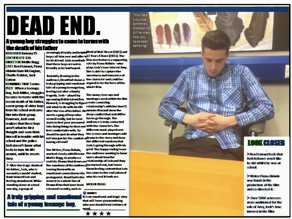
The headline of the article is normally the title of the film, this is in a black and bold font that stands out and is easy to read. Below that is the subtitle, this is sometimes a short sentance that the critic has said about the film, such as "small but perfectly formed", or the logline of the film. The subtitle is in a smaller font tha the title is is not bold howbere it is still bigger than the main body of the article.

At the end of the article there is a verdict section.This rounds op the critics overall thoughts about the film and gives it a star rating out of 5. This fond is bold and stands out against the main body of text.

Underneath the subtitle there is basic information about the film, this includes the release date, the certificate, the director, the cast, the running time and a quick summed up version of the plot.
There is normally a 'Look Closer' section placed voper the main photograph. This section gives 2 or 3 facts that the reader may not know about the film but may be interested in. These are usually usual facts that only apply to that specific film.

Friday 10 January 2014

32. Research into Film Magazines


Sight and Sound Magazine

Sight and sound magazine is a british monthly film magazine ran by the British Film Institution.

http://www.bfi.org.uk/news-opinion/sight-sound-magazine

It is more formal and sophisticated compared to other popular film magazines such as Empire. Below I have inserted photos of pages from the magazine. They use a combination of words and photos in a 'clean cut' style.

This is an independent film magazine and tends to feature mainly art house films and attract a higher demographic audience.


Empire Magazine
Empire is a British monthly film magazine which is less formal than Sight and Sound and mainly read by males. This could be because of the types of film that are featured on their cover which are mainly superhero and action films which stereotypically attract males.


Along with my research, I also found this slideshare which shows more of the conventions of film magazines.


Codes and conventions of film magazines from KirstyW94

As the film my group have made is aimed at mainly teenagers, I think it would be best to base my magazine on an Empire magazine article as these readers typically have a lower demographic such as group E -students.

Thursday 9 January 2014

31b. Final design of poster

This is the finished version of my poster. 

INSET POSTER


Below, I have added annotations to show what conventions my poster includes.


31a. Poster - First Draft and feedback


Before I started making my poster, i drew up a design of what I wanted it took look like. It includes, a magazine review, the title, a large image of josh walking, the names of the main actors, information on to production team, a QR Code and a website.


Here is the first draft of my poster:


Interviewed a member of my target audience to get feedback on my poster and unload their response to sound cloud


The feedback was that although they liked the overall design on my poster, they felt it needed slightly more information on it and also some of the writing was hard to read against the background.


Sunday 5 January 2014

29. Poster Annotation

The poster I chose to annotate was the one from The Hunger Games Catching Fire. I chose this film as it is also a drama and like the film my group and I are creating, it contains a love story. This is also a resent film so it is up to date with the latest conventions of a film poster and shows good techniques to attract the current audience. This film also has the same target audience as ours, being young teens to young adults.


28b. QR Codes

When researching film posters, I came across lots of information about QR codes and also saw them on many recent film posters. However, I didn't really know what they we're used for despite seeing them on many advertisements before. I decided to research more into what a QR Code is. 

First, I went on Youtube and found this simple video that explains the basics about QR Codes. 


I then used other information I found unsung a variety of websites to find out more about what a QR code is. Through my research I found that a QR Code is a 2 dimensional version of a barcode and QR stands for Quick Response. 

The main used of QR Codes are:
In Logistics 
For mobile ticketing
For marketing and communication

Whilst looking for information on QR Codes, I cam across a website called 'QR Suff' where I was able to make my own QR code. Below is the one that I made, if you scan it, it will take you to the youtube video that I liked earlier in this post.


28a. What makes a good Film Poster

A film poster is used to market a film. To be able to attract an audience and gain an interest in their film, film marketers stick to certain code and conventions of film posters.

These are:

  • It must be eye catching
  • There must be a focal picture which will draw in the audience's attention 
  • The title should be displayed in a large eye-catching font
  • It clearly shows the genre of the film
  • An indication of when the film is released
  • Information on the directors and production company that worked on the film
  • Reviews of the film
  • Title of other popular films that the production company or director have made previously


There are four main types of film posters. Many films will have one poster of each type and will release them at different times. Many film marketer chose to release a number of different posters in the run up to a film cinema release as it creates a 'buzz' about the film.

The four main types of film posters are:

  • Character Posters - Posters that contain an image of either one characters, or a group of many main characters from within the film. These types of posters are mainly done to promote a certain actor, especially if there is a popular or well known actor within the film. Sometimes film companies choose to release many different character posters with each character. For example, this was used for the release of Harry Potter and the Deathly Hallows Part 1.

  • Teasers Posters - These are usually the first poster that a film company will release. They usually do not contain a lot of information about the film except a realise date and the main character
  • DVD posters - These posters are usually released the same time as the DVD. They usually contain more reviews as a lot more people have been able to see the film in the cinema than when any of the other posters we're released. 
  • Theatrical posters - These are released the same time as the film goes into the cinema. These usually contain an image of either a main character or a group of main characters. They contain a lot of information about the film such as the director, producers, age rating, release date and sometimes reviews. 


I think for my poster I will choose to make a Theatrical poster as they have the chance to add a lot more information and more of the conventions.

27. Poster Specific to My Genre

When researching posters, I needed to look at posters that a used specifically for the Drama genre. To do this I looked at a list on IMDb called "Most popular Drama feature films". http://www.imdb.com/genre/drama

In this list, within the top 10, were the films:
The Wolf of Wall Street
American Hustle
Winter's Tale
Dallas Buyers Club

So I decided to use these posters as the main inspiration for my film poster.

This poster has the main character in the foreground of the photo so he stands out against the many other people in the background. This instantly shows the audience who the main character is. He is also looking directly at the camera so it catches people attention. The title of the film, is put in a box with a bright yellow background. This makes it stand out and not get lost against the main photo of the poster. Around the title of the film, it also states the production company and main actor of the film. At the bottom of the poster, there are some other names of the main crew members, such as the director an producer. There is also the logo of the studios that made the film as well as the release date of the film. 
 The poster for American Hustle is more simple and against a black background. This makes the audience focus in on the characters. The psoter contains images of the five main actors and their names above each of their photos. Just below the photos of the actors, there is the log line of the film. This attracts people to want to watch the films as it creates questions in their mind that they want to watch the film to find out the awnser.

The poster then has the words "from the director os silver linings playbook and the Fighter". This will attract an aduaince who enjoyed them two perticular films as director usually have a certain genre and type of films that they make.

The title of the film is then written in a yellow fond in large bold letters which stands out against the dark background and underneath the title is the release date. There is also the logo of the studios that made the film as well as a website that you can go on to find out more about the film.

 The poster for Winter's tale is different to the rest of the poster I have chosen to look at as it does not contain an image of any of the characters and instead choses to focus on the setting. The many starts in the sky and the city that seems to be 'shining' in the background stands out an an exciting and magical setting.

The title of the film is written at the top of the poster, in capital letters. The golden colouring reinforces the 'magical' element to this film. Just above the title, there are the names of the three main actors within the film.  Below this there is the logline to the film. This film is unusual as it does not give any information about the producer, director or studios that made the film.


The poster for Dallas Buyers Club introduces the audience to the setting and the main character. The background shows a city in a sunny country and a male standing in the foreground. As he is the only character within the poster, he appears to be the main character.

The name of the film is in large letters and fairly central, this makes it the most import thing within the poster and makes it stand out to the audience. At the top and bottom of the poster, there are the names to the 3 main actors in the film. At the bottom of this poster there is quite a lot of information about the directors and producers of the film. The bottom of the poster also says 'inspired by true events' which will make it stand out against other films and intise people to want to watch the film.

Friday 3 January 2014

25c. Second draft of film

After getting target audience feedback from our first draft, we made some changed, including adding credits at the end and also adding some music in order to make the film more dramatic.

This is our second draft of our film:


I then showed this film to our media teacher and she gave us these further changes to make that she felt would make the film stronger:

  • To add more shorts of Josh and Amy in their montage, such as in different locations
- Although we thought this was a good idea, we no longer had any time to re-film some shots. This however is something that we would do if we could re-film or had more time as it would give the effect of a more developed relationship as they have spent more time together, rather than just being on one date.
  • To get rid of the panning shot at the very beginning of our film
- This is because it is not a very smooth pan. Again, it is something we would re-film if we had time. We did try to edit out this pan by using a cut-away shot, however, we could not make this work so it gave a good effect.
  • When Josh walks out of the room, have him get up off of the bed straight away instead of showing him sitting for a few seconds before
-This is something we did managed to change and he now stands up off the bed immediately.
  • To add the sound effect of a TV when Josh and his mother are watching TV in the living room, as this would make it more clear what was happing
-We also managed to do this. We added a clip of the BBC news soundtrack over the top of the scene. If we could re-film we would also use a close up of the TV to add even more clarity tot he situation.
  • To cut down some of the shots of the montage of the gang in order to make it tighter, such as the shot of them walking down the street and also their handshake.
-We did do this, we halved the length of the shot of the gang walking down the street, as this still gave the same effect but make the montage have more fast paced editing. We also cut off the end of the shot of the handshake as again, it still give the same effect without it and made the montage tighter.
  • Cut the shot of Amy walking over to sit next to Josh in the corridor, so that Amy comes into shot sooner
- We cut a lot off of the beginning of the shot so now Amy is seen to walk into shot almost straight away.
  • Add in a close up of the teacher shouting at Josh, as this would show more of his anger
- We had filmed a close-up of this already. However, because the actor was constantly moving throughout the shot, there was no time that we was able to add the close up in without causing a jump cut which didn't look nice.
  • Add more shots of Josh's bedroom after he has destroyed it
-Although we already had one shot of this, when Josh walks out of the bedroom, it would be good to focus on different specific elements of the room as this would focus more on it.
  • To cut down the short of Josh walking over to the gang to give back the knife, as it showed too much of the walk over which was unnecessary.
-We also cut down this shot and only showed half of what was in the first second draft, this makes the short shorter and more dramatic.

25b. First Draft of Film and feedback


To get feedback on the first draft of our film, we used a flipcam to interview two members of our target audience and hear their views on the film. 


They commented on positive things about the film, such as liking the composition, but also commented on things that we could improve on, such as not being able to hear the voices of the characters. To fix this we need to edit the volume of the sound on Adobe Premeire pro to make the voices louder. Another improvement that they mentioned we should make is to make sure we are always using match-on-action as sometimes characters moved when the shot changed. Match-on-Action is part of continuity editing and means that when something is happening in a scene, when the shot changes, the action should still stay the same. I decided to look into match on action to make sure I knew exactly how to fix this problem form within my film and found this slideshare that I used to get information


Thursday 2 January 2014

25a. Post-Production Process

 After the production process, we started post-production. To edit our short film we used Adobe Premier Pro software.

As seen in the screen shot below, we started by importing all of the clips and watching them through. At this point many of the shots were very long and needed cutting down. During filming, many shots took more than one take so we started by going through and choosing the best ones to use in our final film.


 Once we had chosen all of the best shots we started putting them together and cutting them down. This can be seen in the photo below.

In some shots, we had to overlap the sound and the picture, this is because we wanted the sound from one shot to be continues even though the image on screen changed. To do this we had to overlap shots and turn he sound off in the 'Audio 2' section. This can slightly be seen below. 


After feedback from our target audience, we added music into our film. To do this we went on freemusicarchive.org to choose a song, the downloaded it. To get it into Adobe Premier Pro, we imported the song and then dragged it into the audio section. The music is the green bar in the photo below. We used music to show the characters emotions and make it clear that the montages are not in real time.